To view these projects as they were intended to be seen, please visit this portfolio on a desktop screen. A tailored mobile experience is currently in development.
Note
I apologize for any inconvenience caused.
FareShift
Visual Case Study
VPN Integrated Flight Booking App
Software used: Figma, Claude Opus 4.6, ChatGPT Sora and Google Gemini 3.1 Pro
TLDR
The modern flight search is not a transparent marketplace; it is an asymmetrical system designed to maximize airline profit. Aggregators exploit user location and obscure historical data to create false urgency. Travelers are forced to make high-cost decisions completely in the dark, lacking the tools to bypass algorithmic price gouging.
Date
March-June 2026
Role
Solo UI Designer
Solo UX Designer
Topics
UI Design Concept
Final Result
Theme: Glassmorphic

Screen 1: Bypassing geo-pricing
An integrated VPN toggle allows users to bypass regional markups directly from the search flow without leaving the app.

Screen 2: Eliminate Decision Paralysis
Categorized arched paths (Best, Fastest, Cheapest) replace endless lists to minimize choice overload.

Screen 3: Streamline Itinerary
Vertical timelines map out complex layovers at a glance.
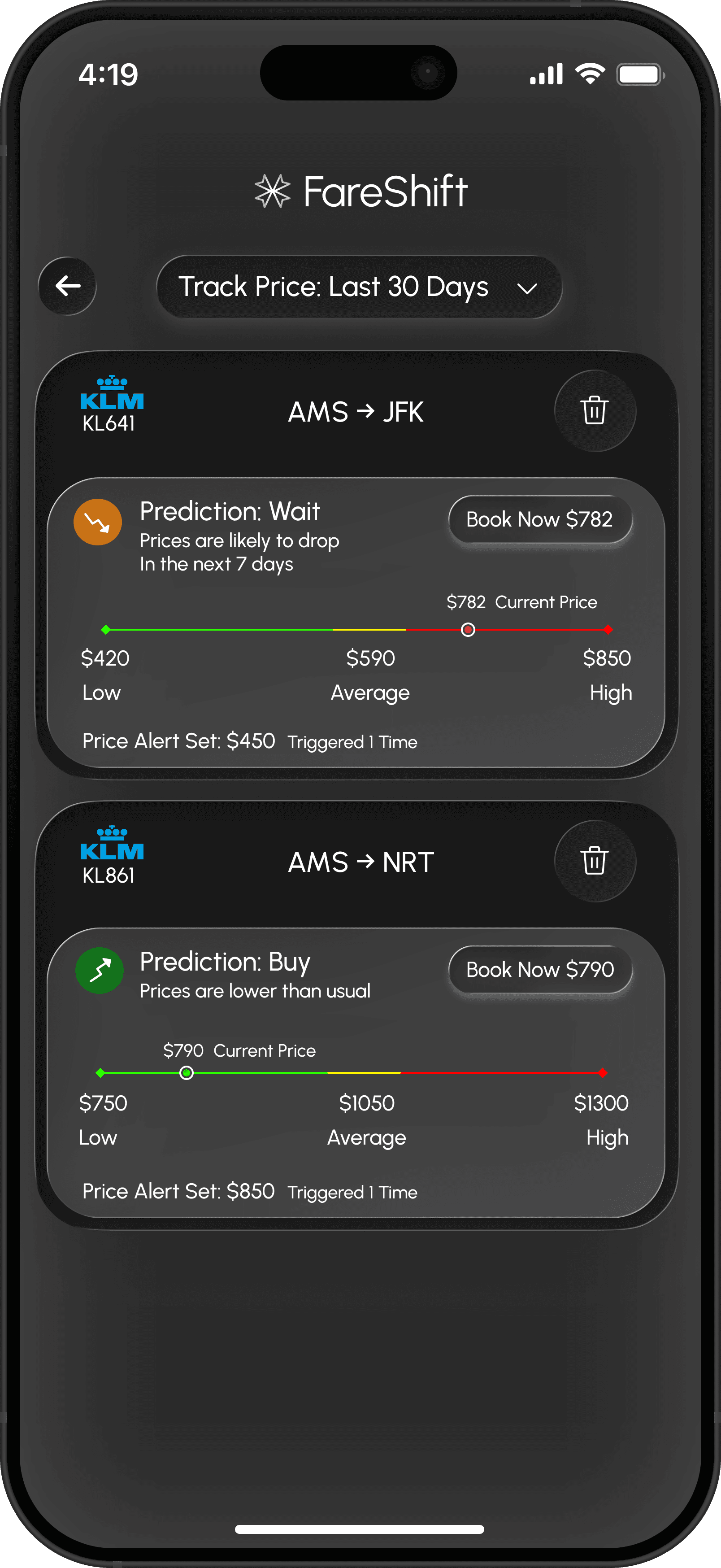
Screen 4: Automate Price Monitoring
Replaces complex, fatigue-inducing price graphs with a simple linear scale and a booking recommendation.
Problem Statement
Finding a flight is easy; knowing if you are being ripped off is hard. To secure a genuinely fair price, a user must manually cross-reference historical data while manipulating their own IP address across multiple tabs. There is no single, unified interface that provides both the analytics to judge a price and the utility to bypass regional markups.
Goals to be solved
Bypassing geo-pricing
Eliminate Decision Paralysis
Automate Continuous Price Monitoring
Information Architecture
Flight Price Tracking
Designed to eliminate decision paralysis and prevent data overload. Instead of forcing users to analyze complex market trends, this card translates historical pricing into a simple linear scale and delivers a definitive, actionable prediction: Buy or Wait.
Informal Interview: 3 Participants
User Research
Interviewed analytical professionals, including a Financial Broker, an ML Engineer, and a Mechatronics Engineer.
The Problem
Complex price graphs cause immediate decision fatigue. No one wants to analyze raw numbers just to book a flight.
The Solution
Pivoted away from technical charts to minimize cognitive load, replacing them with clear, pre-calculated booking suggestions.


Flight Time and layover
Reasoning
This UI component is designed to eliminate choice overload by categorizing complex flight data into three core user priorities: Best Overall, Fastest, and Cheapest. Instead of a standard end less list view,
It utilizes an arched flight-path visualization where nodes represent layovers, helping users instantly understand the route structure and make faster booking decisions.
Note
Testing revealed that Claude 4.6, ChatGPT, and Gemini heavily bias toward the conventional. Unable to replicate specific structural guidelines or subtle UI curvatures, the AI simply mirrored my base inputs or generated standard booking screens.


Design Directions
Early Concepts (Light Mode Scrapped)
Reasoning
Peak flight booking happens at night, I designed the app exclusively in dark mode. This eliminates the harsh glare of a white screen in a dark room, minimizes eye fatigue, and creates a more focused, premium environment for comparing prices and making decisions.
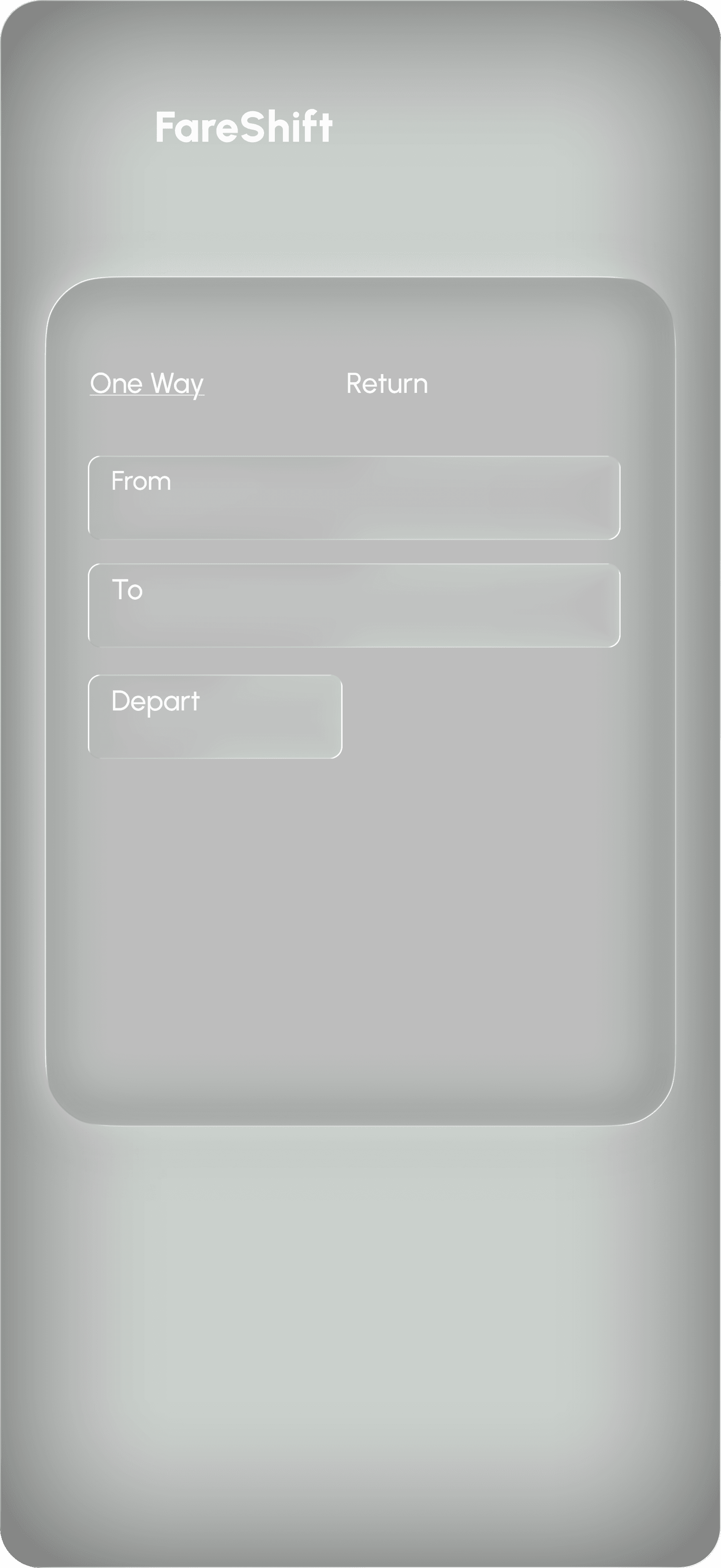

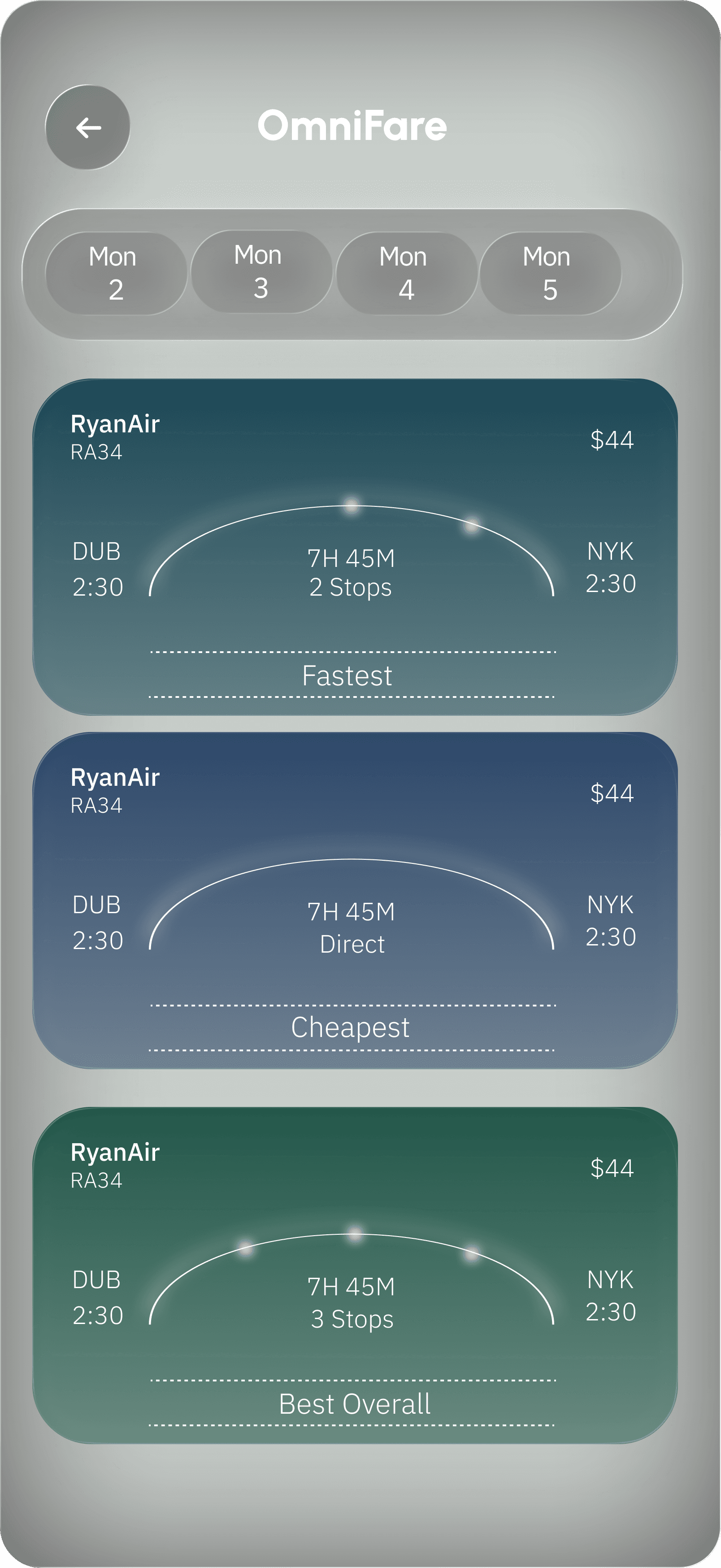
Visual Design Concepts
(Scrapped due to not passing WCAG contrast guidelines)
Visual Styles
I originally intended to use a glassmorphic card on a matching background, but because glassmorphism relies on transparency, it created low contrast for the text. This had to be scrapped due to it not passing WCAG guidelines.
Note
Glassmorphism introduces significant user experience challenges for individuals with visual or cognitive disabilities. Therefore, a higher contrast colour in relation to the background was chosen for the final design, in this case, black.


Research and Ideation
Initial wireframes
Lo-li wireframes to map out the user flow of the app


AI Wireframming
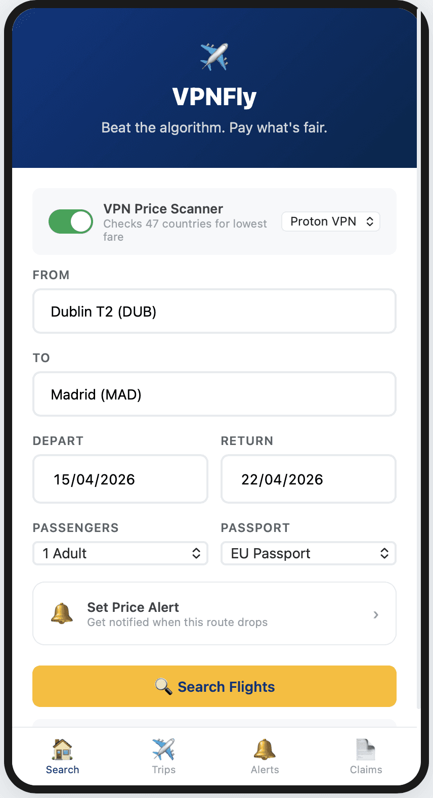
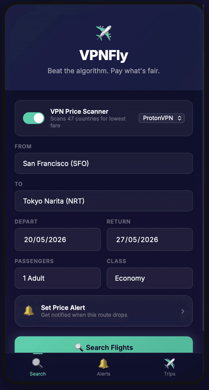
Claude Opus 4.6 Claude Code HTML File
Prompts Used: 7
Prompt
A VPN based flight booking app for the cheapest flights, include typical flight booking layout. With the VPN directly integrated into the booking screen. Ensure to show the user a clear comparison between the prices of different countries, also display the discount percentage difference, and the value in Euros.

Price Graph Wireframming by Gemini
Prompt
Make a flight booking travel app with a price-tracking graph. Indicate if the current price is a good deal compared to past prices (Use 24H,3D,7D and 14D and so on to compare percentages), and include optional price drop notifications for the user. Keep the flow as simple as possible and look up real flights; do not use dummy data. Take as much time as you need.
Prompts Used
12 Variations of this prompt were used. the 12th try generated a usable UI interface.
Notes
I uploaded lo-fi cards of what the price charts and decision-making should look like, but it stayed very similar to my wireframes. It did not try any other design styles, even when instructed. The AI crashed twice before it could give me a usable result.


Key Learnings
01
Token & Time Burn: Running out of tokens/hitting limits mid-wireframing is incredibly frustrating.
02
Context Loss: After 4–5 prompts, the AI often loses its context memory and begins hallucinating, which burns valuable tokens and wastes time.
03
Lack of Originality: When prompted to iterate on visual designs, the AI frequently recycles my own provided wireframes as its own work, only apologizing when corrected.
Case Studies